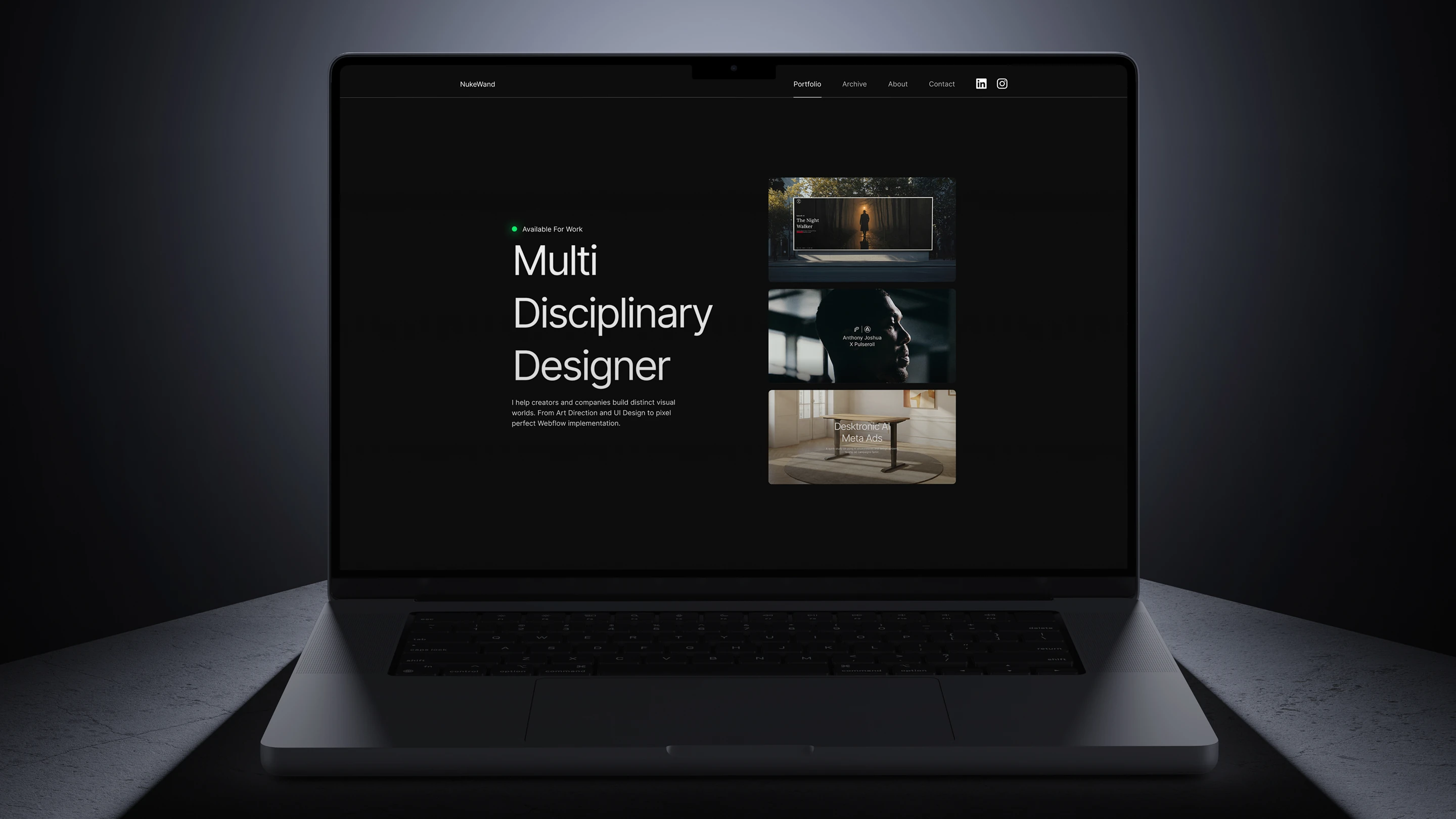
From Architecture to Production
This portfolio is a living design system. I built it to be performant, accessible, and easy to scale. By syncing Figma variables and semantic tokens directly with Webflow, I created a pipeline where the live site stays a pixel perfect match for the design
I built this system in Webflow using Finsweet’s Client-First methodology. By standardizing folder structures and class naming conventions, I ensure the build is modular, clean, and developer friendly, allowing for rapid updates without the risk of breaking site architecture.
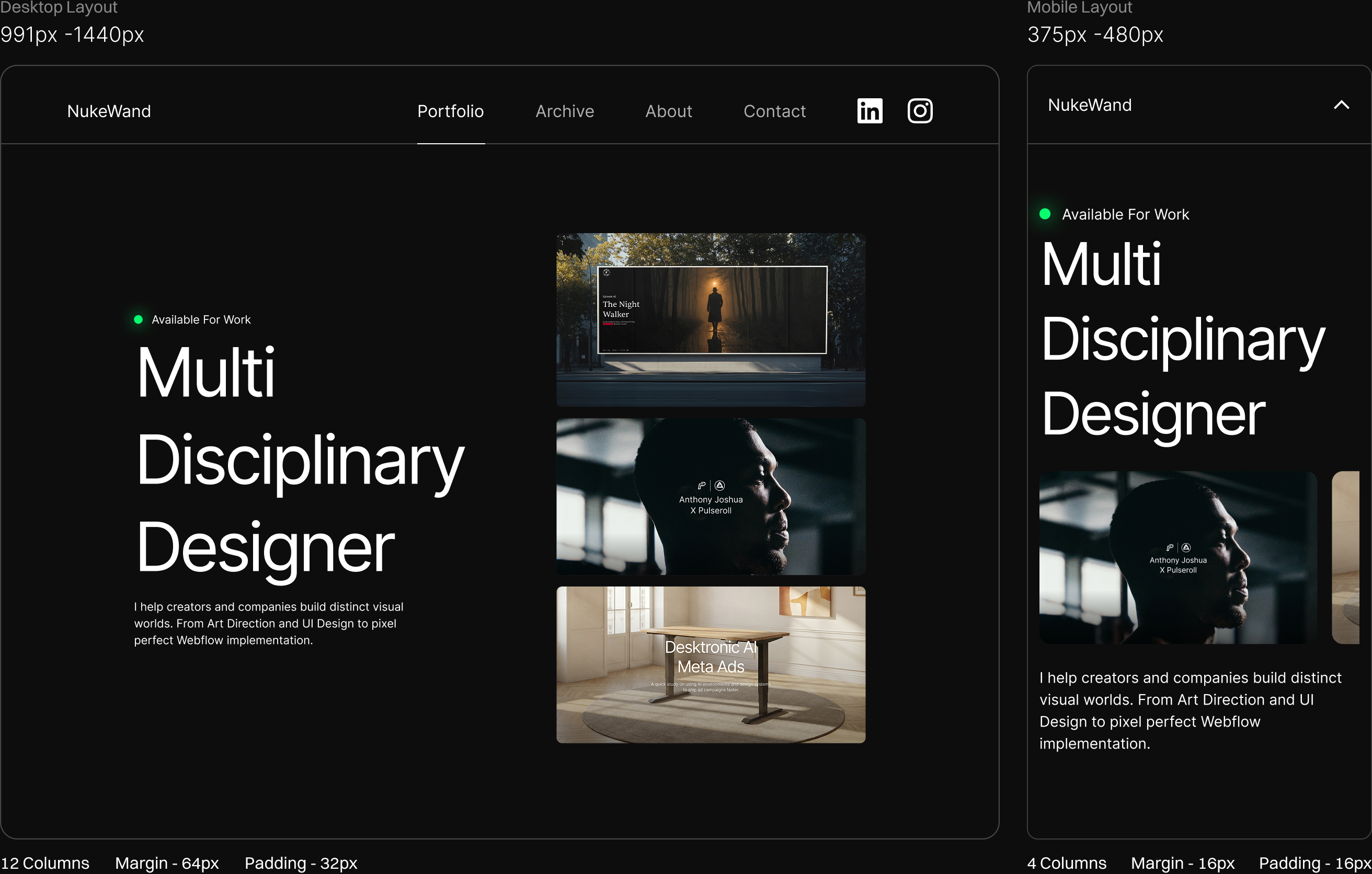
Responsive Design
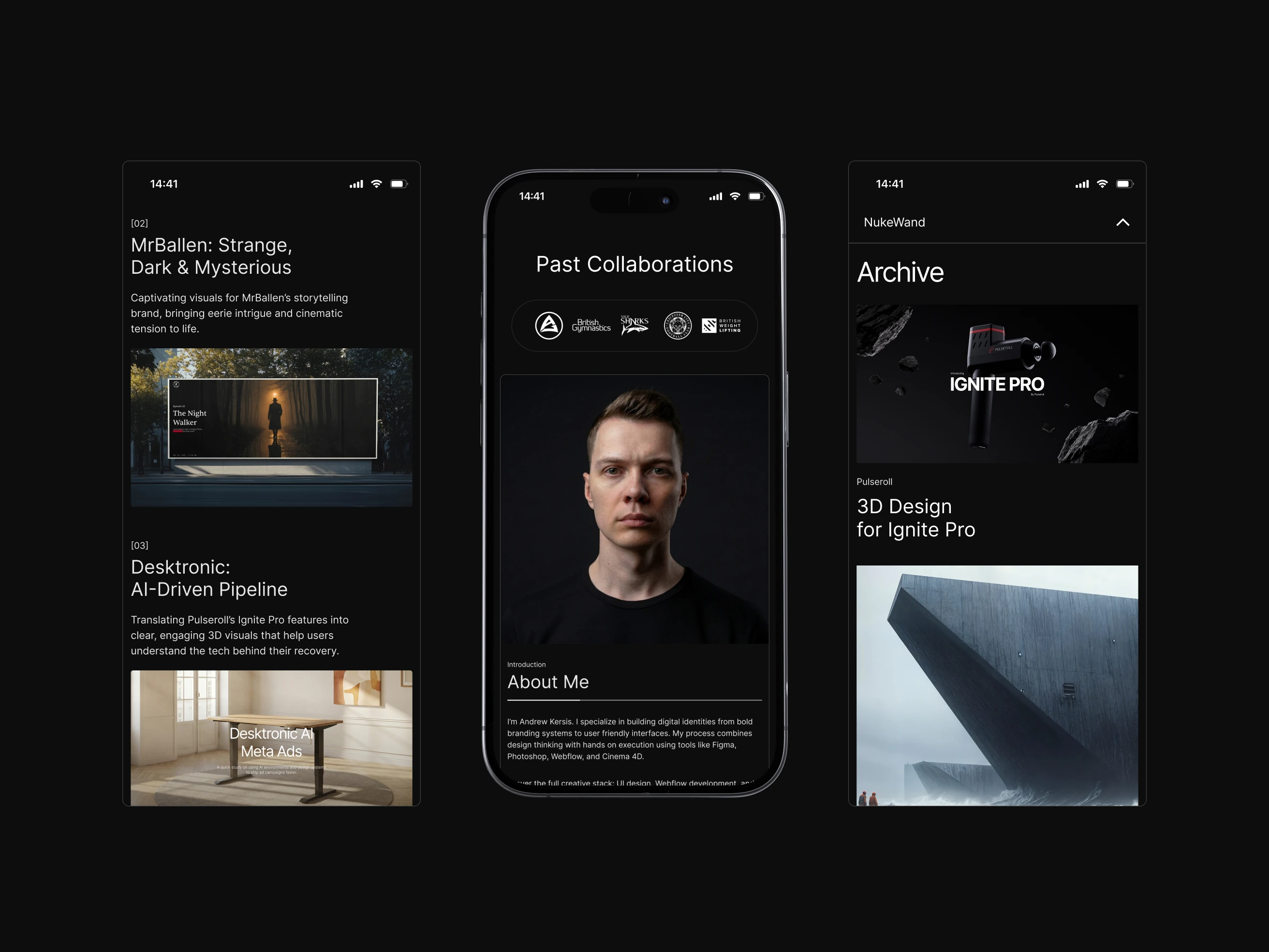
I architected a fluid component library that handles content reflow at the logic level. This ensures a consistent brand experience across desktop and mobile, keeping the design clean and usable on any screen.
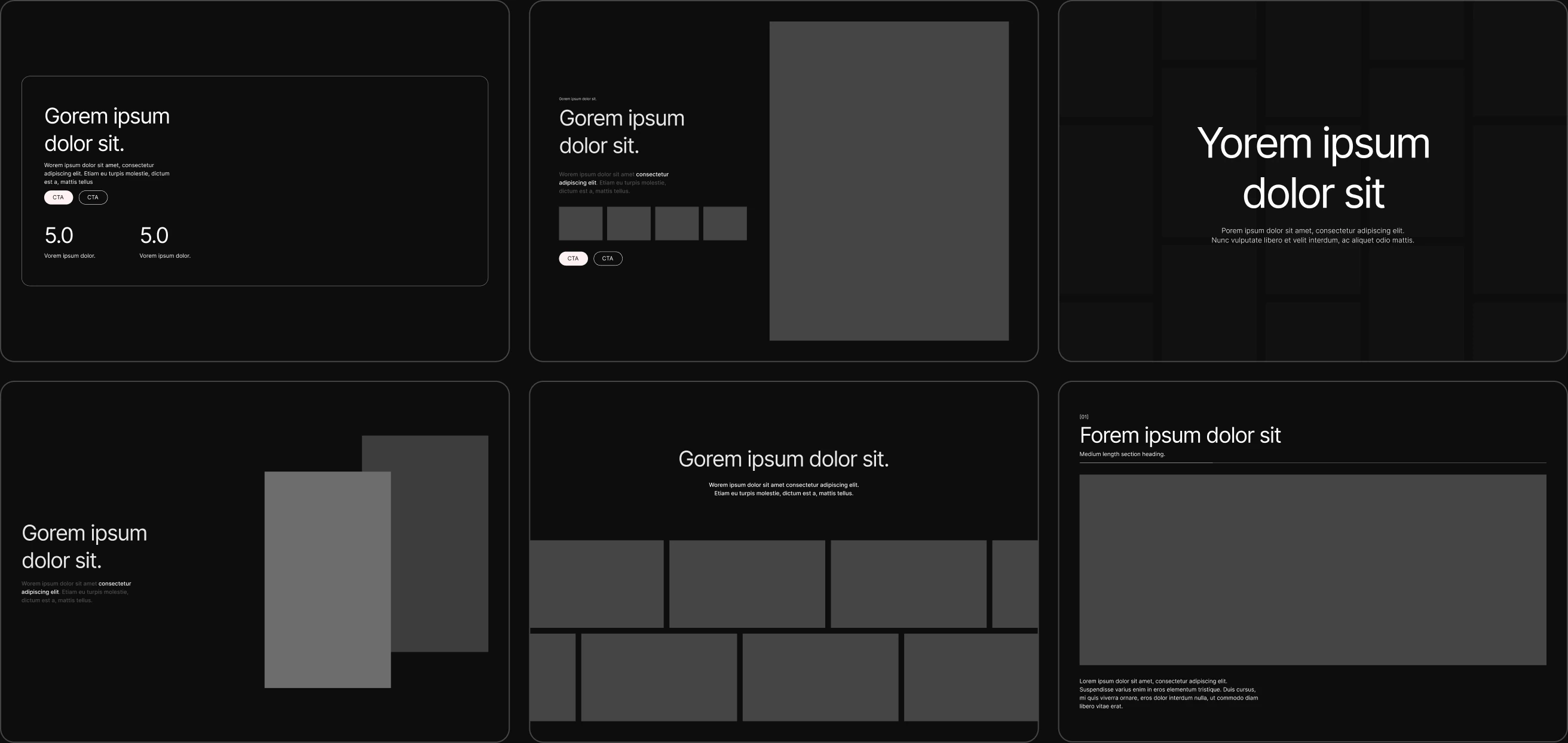
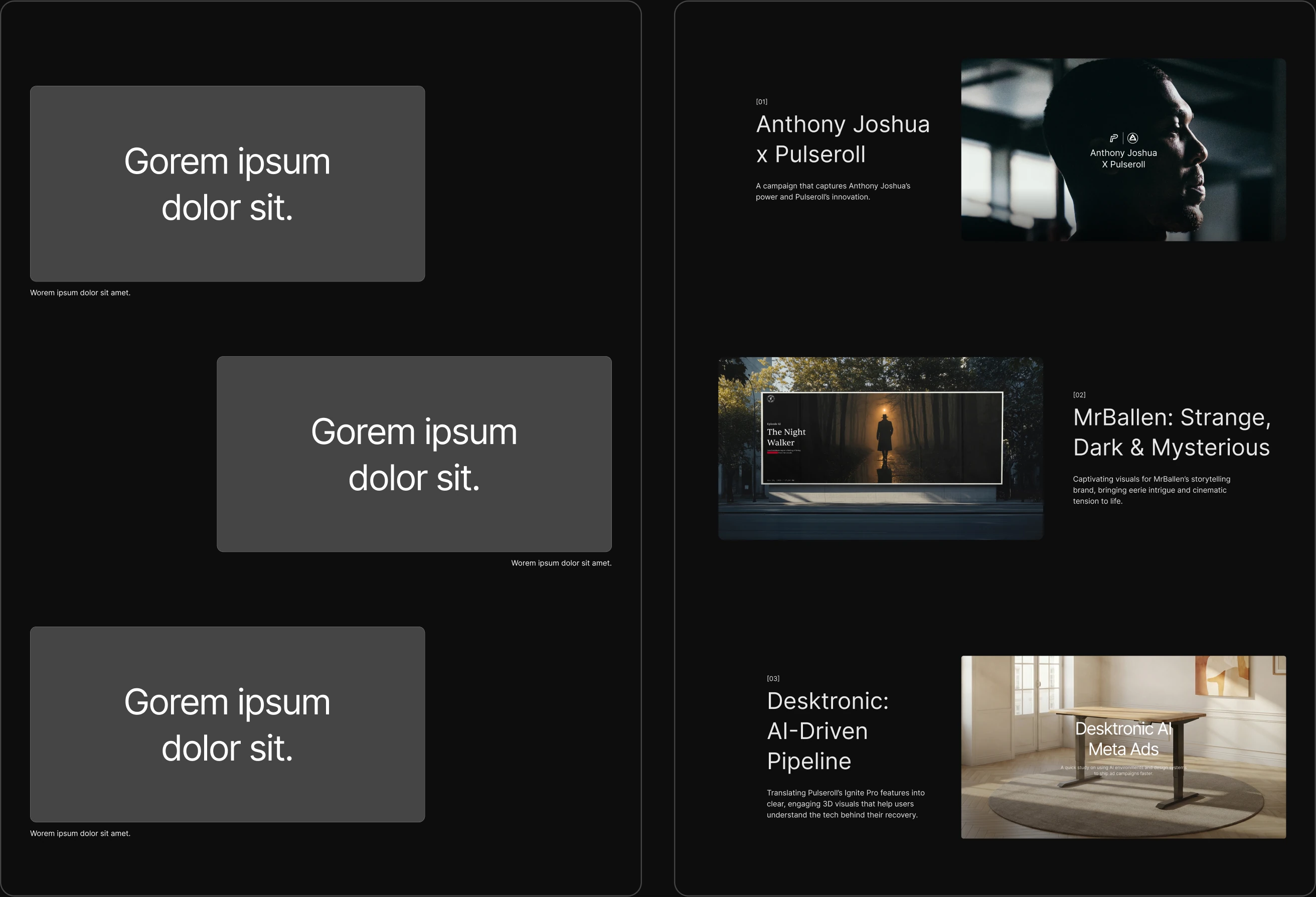
From Wireframe
to High Fidelity
I start every project in low fidelity to validate the layout and information flow. This ensures the site structure is optimized before I add any branding or visual polish.
Design Foundations
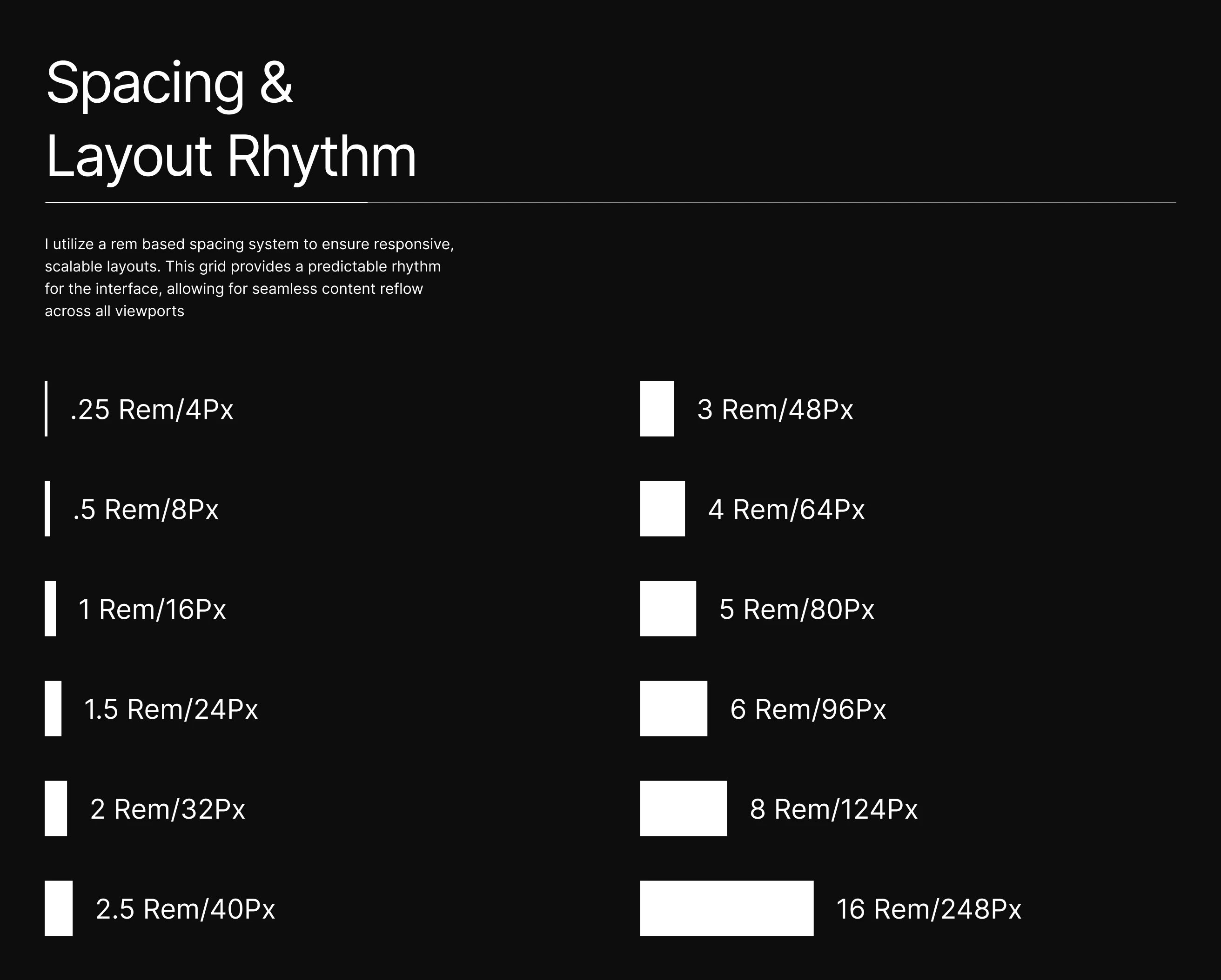
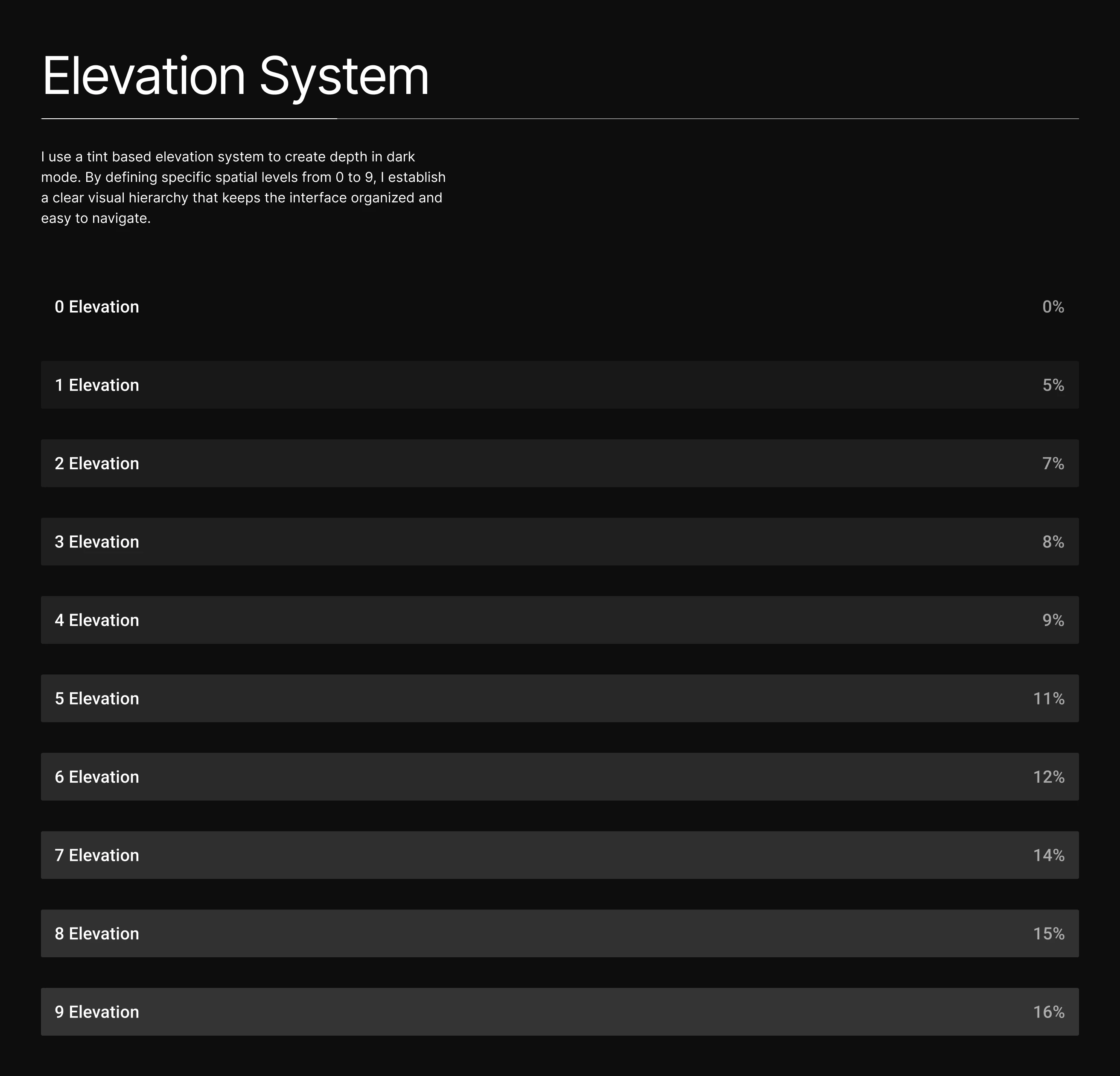
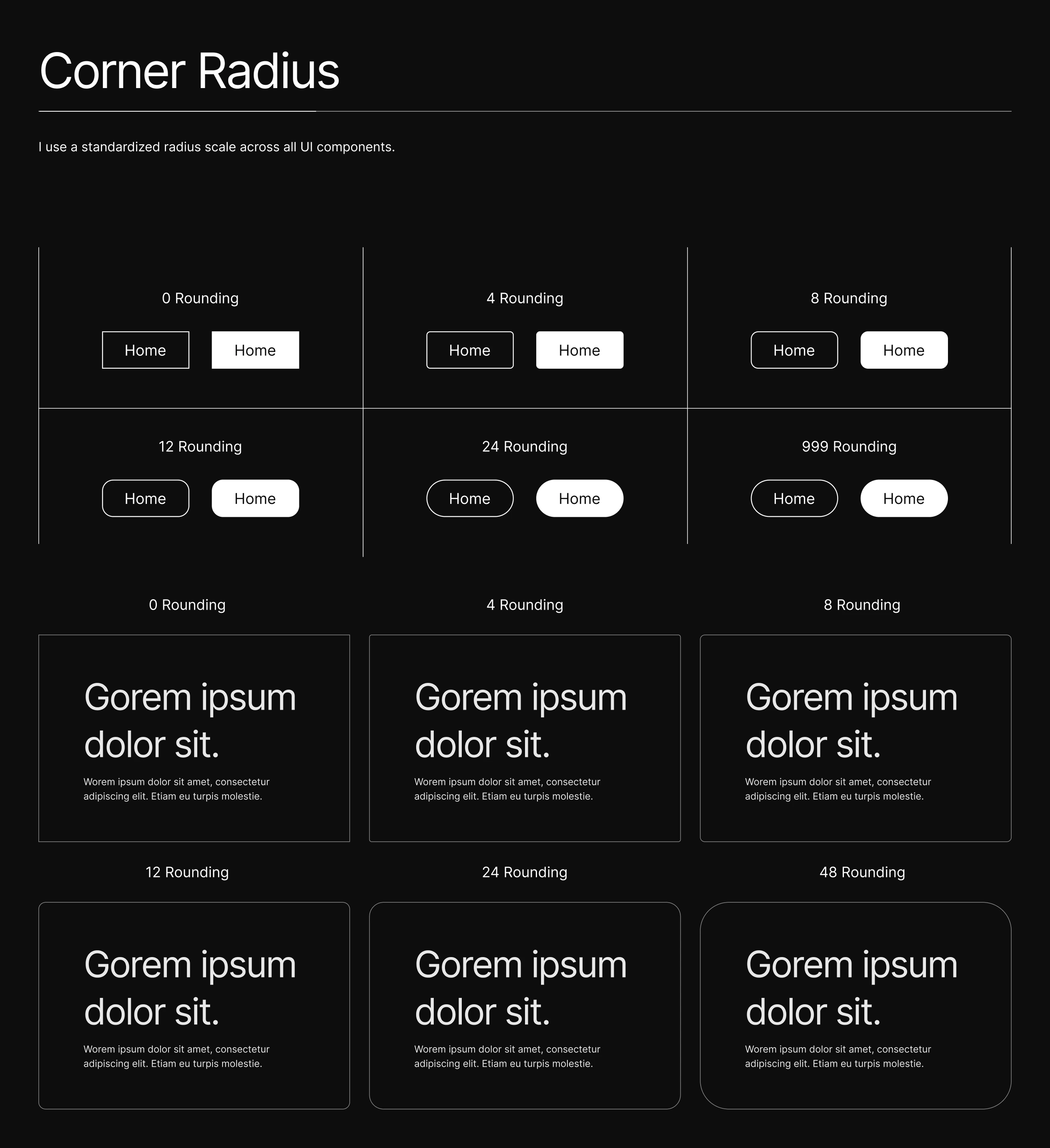
The visual language is built on a modular scale. Every element from color and typography to spacing and elevation, is defined by a strict token system, ensuring consistency and WCAG AAA accessibility at every scale.
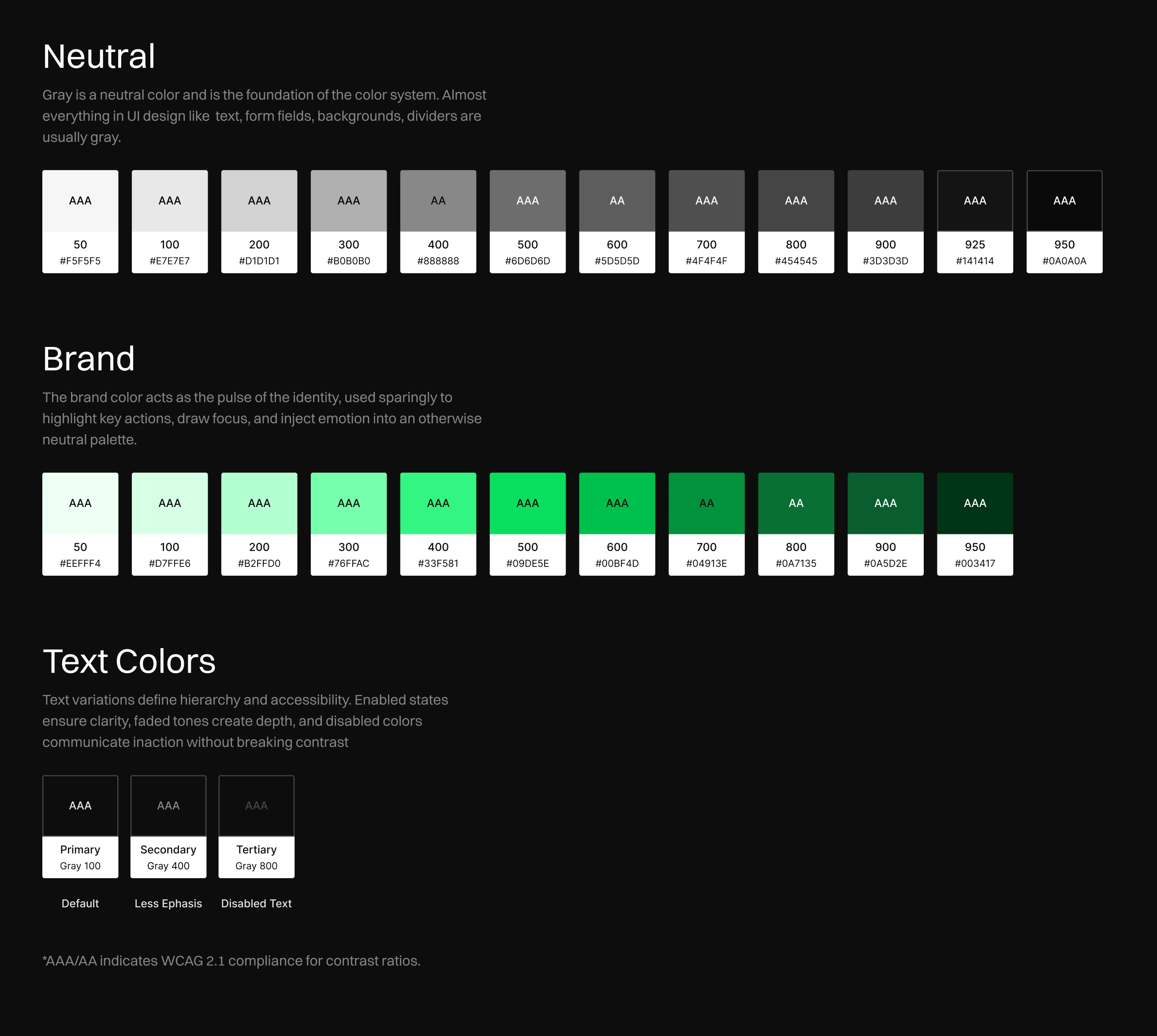
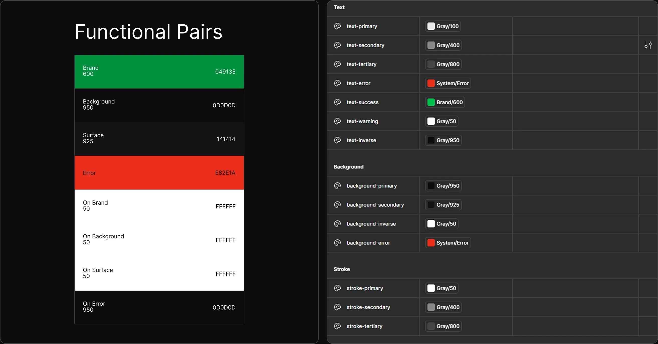
Semantic Color Tokens
I treat design tokens as a functional database. By mapping these raw color scales to functional roles (e.g., text-primary, surface-error), I create a system that is themeable, accessible, and ready for clean frontend handoff.
Components
& Iteration
Great design is not a single shot, it’s the result of rigorous iteration and modular build logic. I architected this system to be reusable from day one, isolating components into distinct states and exploring dozens of layout variations to ensure the final build is structurally sound.